Photoshop: Tutorial: Using the Info Panel to Color Correct by the Numbers
This tutorial will be help the user understand how to color correct using the info panel and curves adjustment. This is highly useful when you can’t rely on your display for color accuracy.
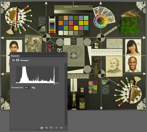
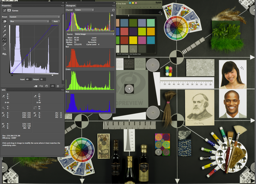
I’m illustrating this process by choosing an image that is used to portray texture, sharpness and color rendering of a camera. It has a full range of textures, tones, colors and saturation.
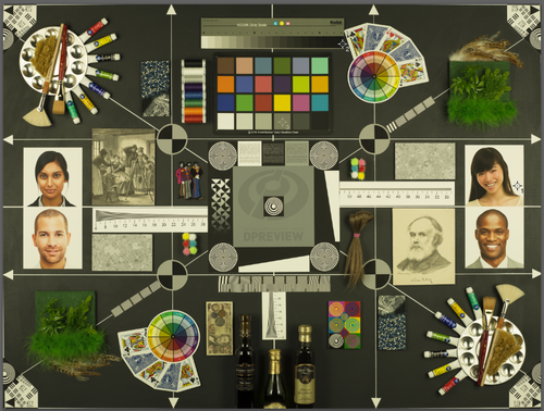
The image is very warm, and will need the color cast removed. It is effecting the white point, the gray point and the black point.
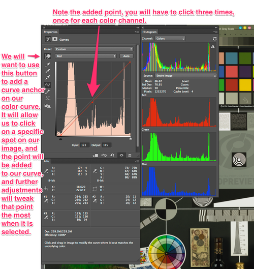
Our first step is to identify where the eye dropper should set a point sampler. We can create 4 point samplers at a time.
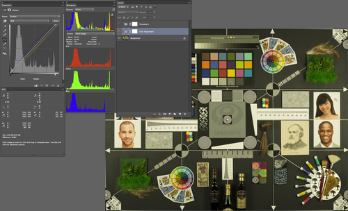
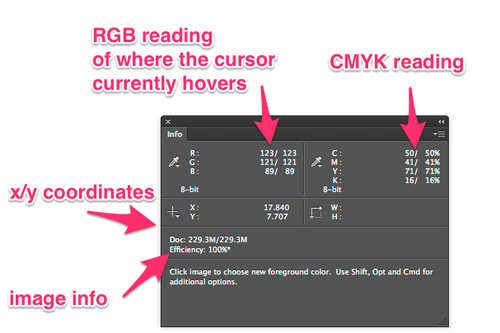
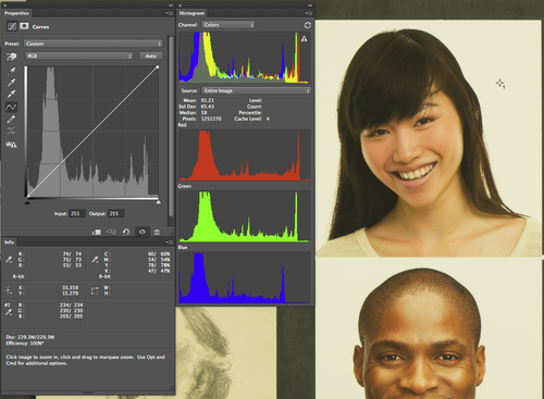
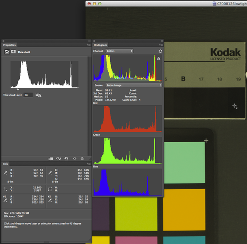
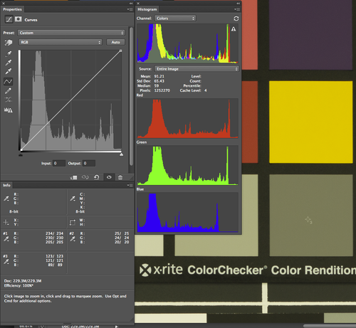
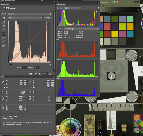
First lets examine the info panel:
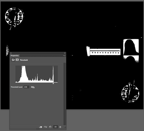
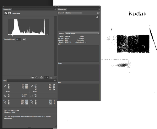
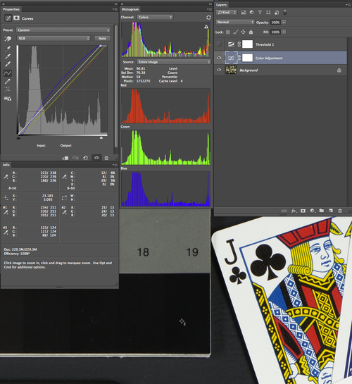
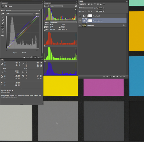
In order to identify which point on the image could represent a nice clean printable white point, (that is not a spectral highlight) you may use the threshold adjustment layer, or use curves, and drag the white point slider while holding option toward the center of the curves panel. My illustration must use threshold because I can not take a screenshot of the curves panel preview while holding option.
Drag the slider all the way to the right to see any pixels that have a reading of 255, then start sliding it toward the left until you see pixels appear in mass over an area that you know should read as a clean white. We will choose the white of the background of the woman.
Use the eye dropper tool (i) and hold shift while clicking on the image. That will create the first point sampler.
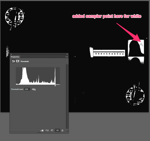
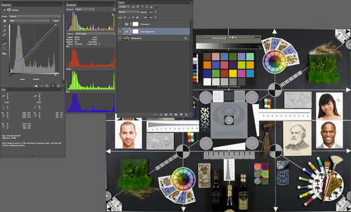
Observe the image zoomed in where I have chosen the white point.
Now Let us choose the black point.

Note the RGB values for our black point.

Now let us pick our gray point. Normally this can be quite difficult, but for this image our gray point is known to be a perfect gray,
Note that the R and G values are 30 points higher than the B value.
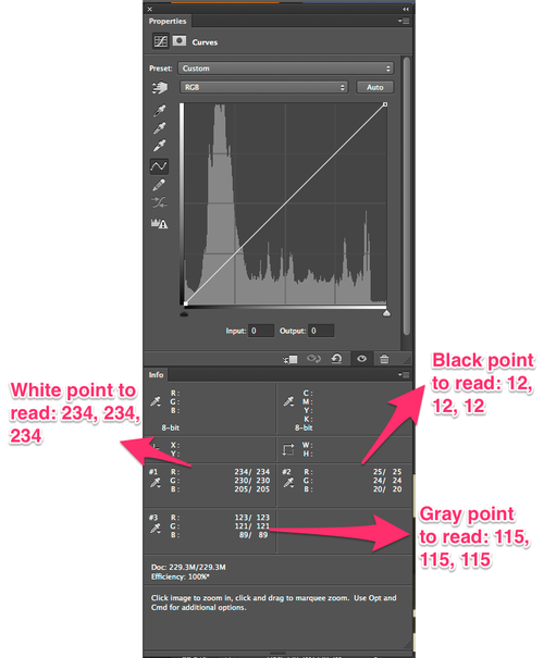
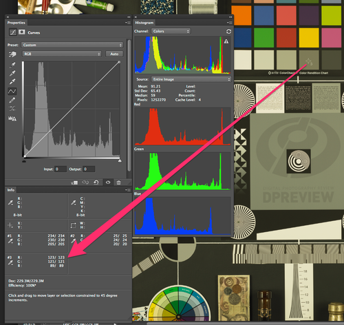
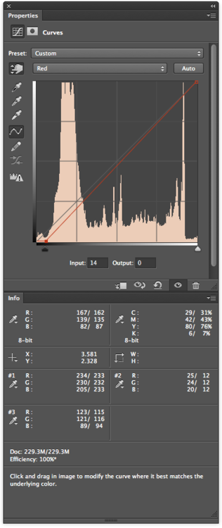
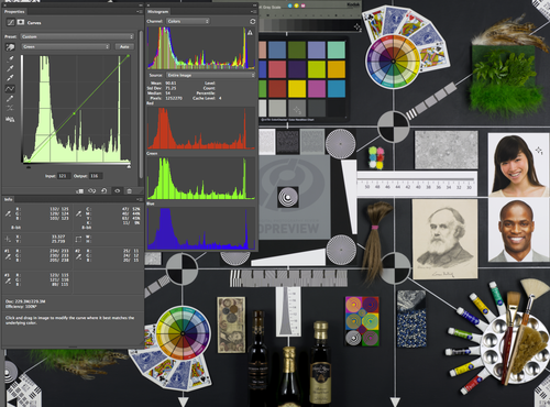
Our next step is to adjust the white point.
We are somewhat constrained by the white point value of the Red channel. Note that it reads 234. We can push it as far as 245 to maintain printable detail, but for illustration sake, lets make the Red White point our baseline, and raise the Green and Blue white points to match.
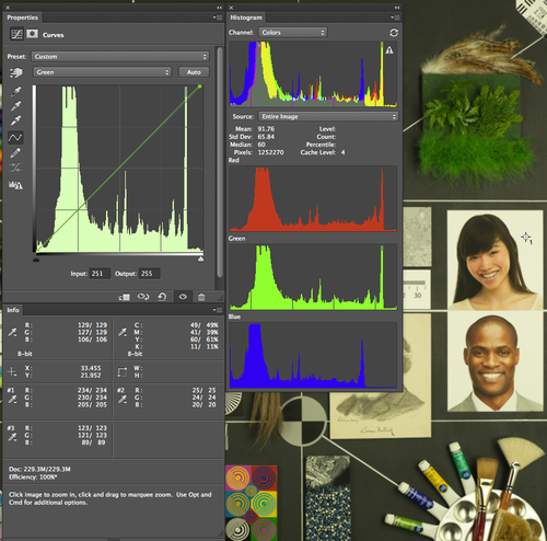
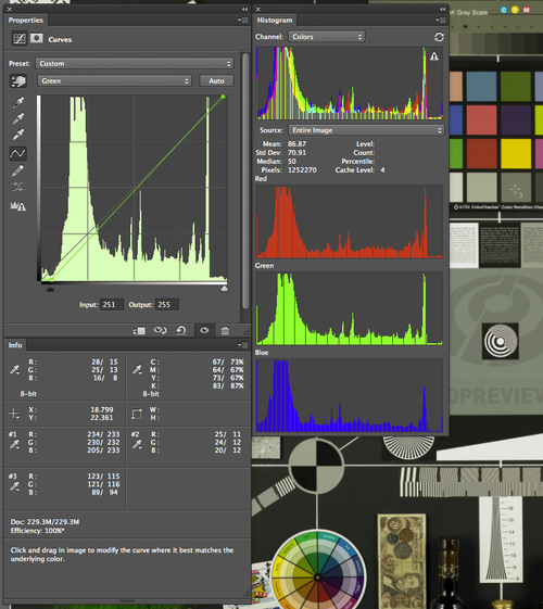
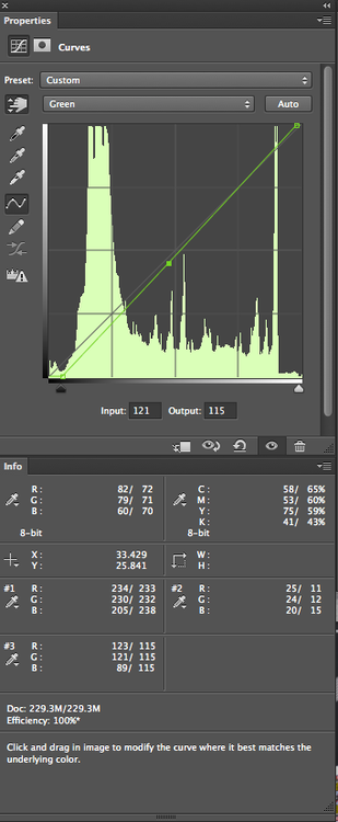
Lets choose our green channel in curves, and slide the white point over toward the left until the white value is equal to the Red white value. Please note that the RGB values on the left of the slash show you what the color values WHERE, and to the right of the slash, what the color values are NOW. We raised the Green white point from 230 to 234.
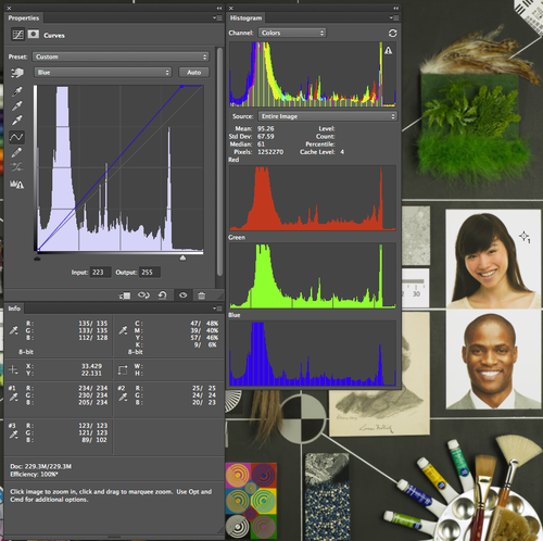
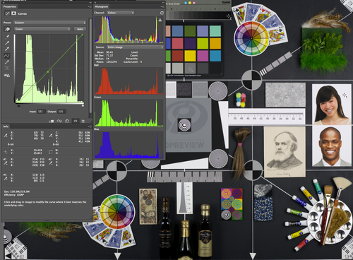
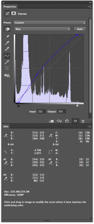
Now lets repeat the process with the Blue Channel; from 205 up to 234.
Lets repeat the process now, but we will adjust the black point. We don’t want our black swatch to read as 0,0,0, because it would crunch the blacks down too far, and we would loose detail, so lets aim for R12,G12,B12.


Note that our black values are reading as 12, 12, 12. Also note that after shifting the black point, we have also altered the Green white point a tad. We will notice a greater shift after we adjust our gray points.
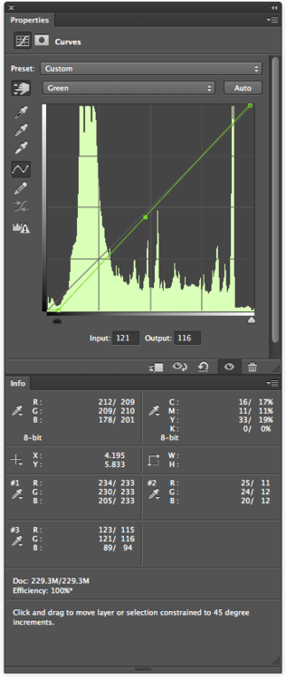

Move the Blue gray point up to 115

Move Green gray point down to 115.
Note that our Black point and White points shifted a bit.
Please shift the white and black points back to where we aimed them to be before.
Our white points, gray points and black points are all equal now. The image is a tad dim, and could use with a white point pop, so lets push our white point up to 244.

Lets zoom in and examine the actual point sampled spots.

And finally, the Before and After.